UPDATE: May, 2015
My enthusiasm for the Pilot Falcon has not diminished one bit since my initial review was published in June of 2014. If anything, it’s grown.
The Pilot Falcon is one of very few fountain pens I can whole-heartedly recommend to people looking to spend more than $100. It’s in the same ranks as the Lamy 2000, Pilot Vanishing Point, and Pilot Custom Heritage 92. The fact that Pilot makes 3 of the top 4 $100+ pens that I recommend to people should tell how highly I think of the brand.
The Falcon is intriguing because of its soft, semi-flex nib, but there’s so much more to it than that. The size and weight of the Falcon will please most users and I don’t think anyone can complain about the build quality. Even if you’re not looking for a “flexible” nib, its softness provides a wonderful writing experience and it really shouldn’t be overlooked.
This review was originally published in June, 2014.
Today I’ll be reviewing the Pilot Falcon in resin with rhodium trim. Most of you are probably familiar with this pen but under the Namiki name. They’re the same pens but Pilot is transitioning away from the Namiki branding. This is also the first time the resin Falcon has been available with rhodium trim. So let’s take a closer look.
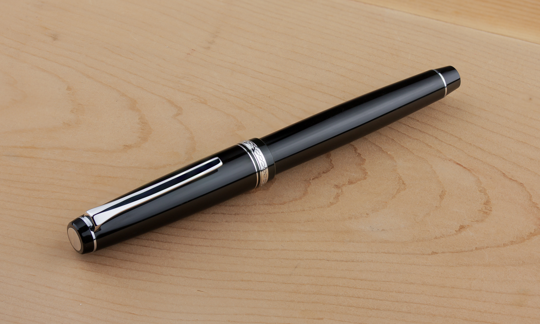 Like many of Pilot’s more high end pens, the Falcon sports a conservative design of highly polished black resin with gold or rhodium trim. The flat cap and barrel ends give this pen a classic look but the modern clip design keeps things fresh and prevents the pen from coming off as old and boring. In addition to the various thin bands that accent the pen there’s a shiny disk on the top of the cap that helps catch your eye.
The cap band is minimal but does feature a chain-link style detail with “Pilot Japan” on the back side, the only branding to be found on the pen besides on the nib.
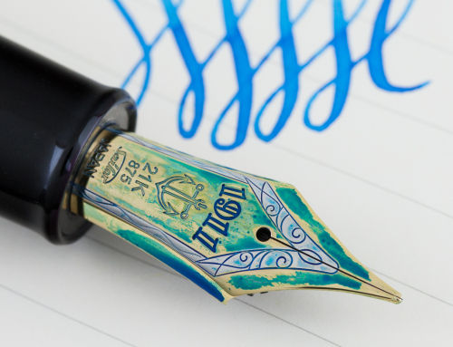
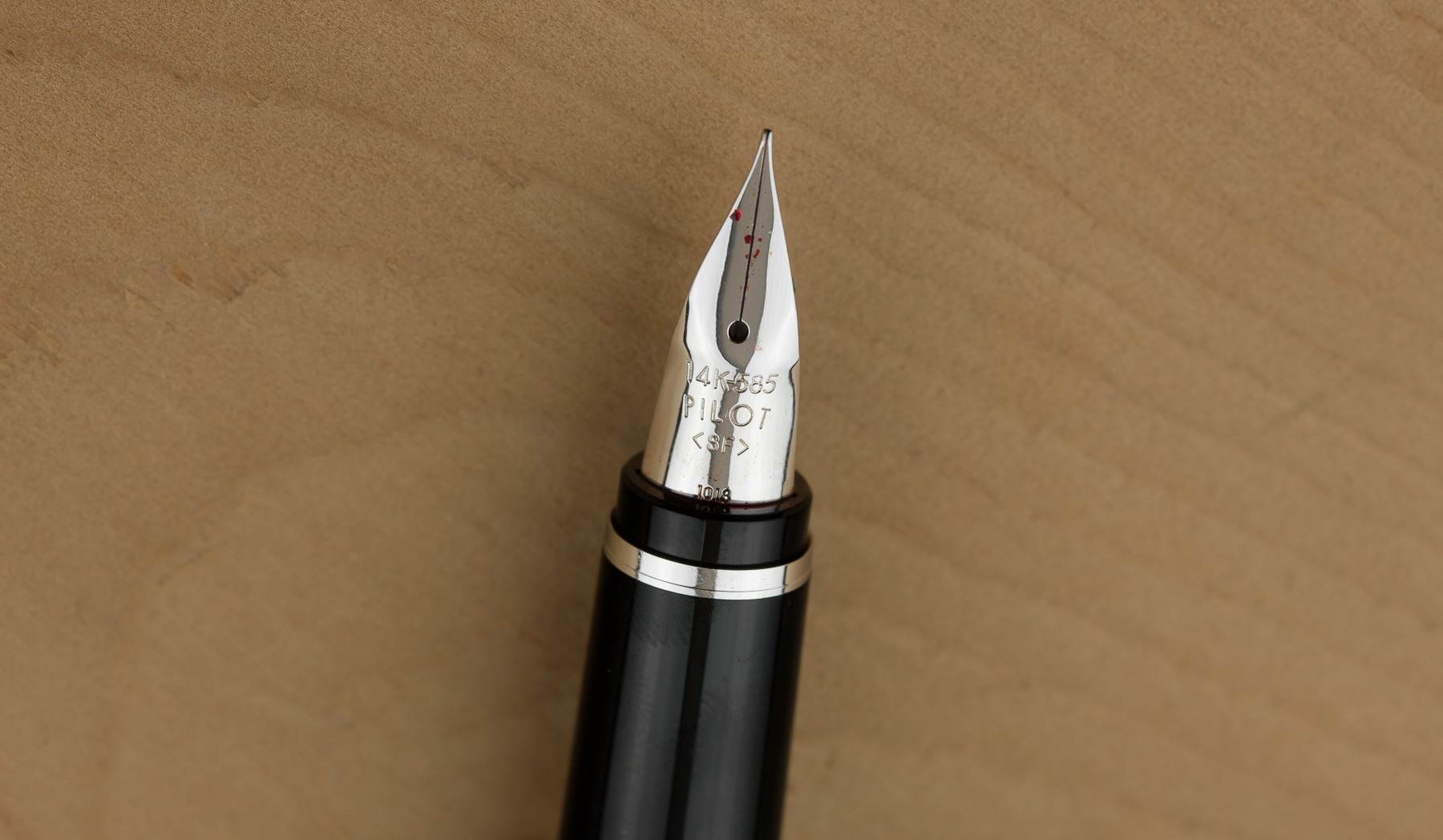 And the nib is really the main attraction of this pen. It’s why this pen is as popular as it is. It’s made from 14k gold and available in soft extra-fine through broad widths. The nib’s unique shape allows the tines to be more flexible than today’s standard nib shape. It took me a long time to get used to the look of this nib, but as soon as I experienced what it can do, I got over its look very quickly.
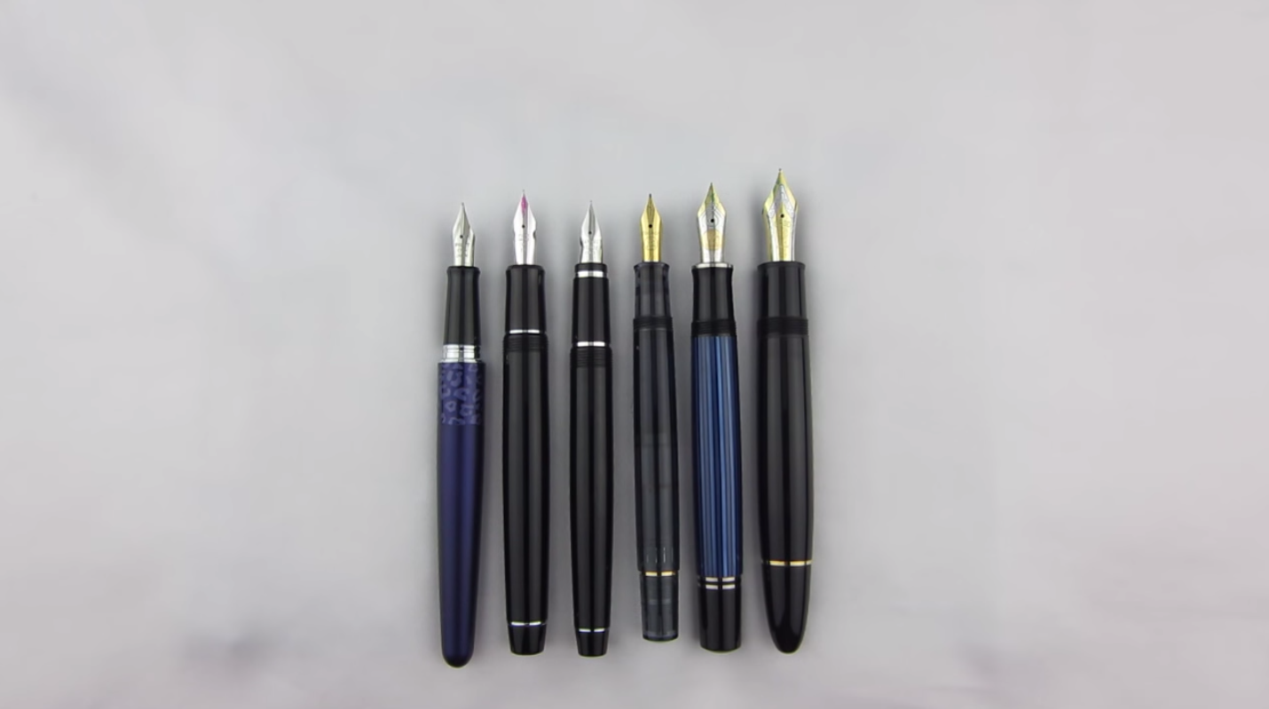
The Falcon is an averaged size pen that’s a bit on the thin side as seen here next to the Pilot Metropolitan, the Pilot Custom Heritage 912, the Pelikan M200, the Pelikan M805, and the Montblanc 149.

Uncapped, the Falcon is actually quite long. Notice that it’s just as long as the Pelikan M805 and Montblanc 149, but as thin as the M200.
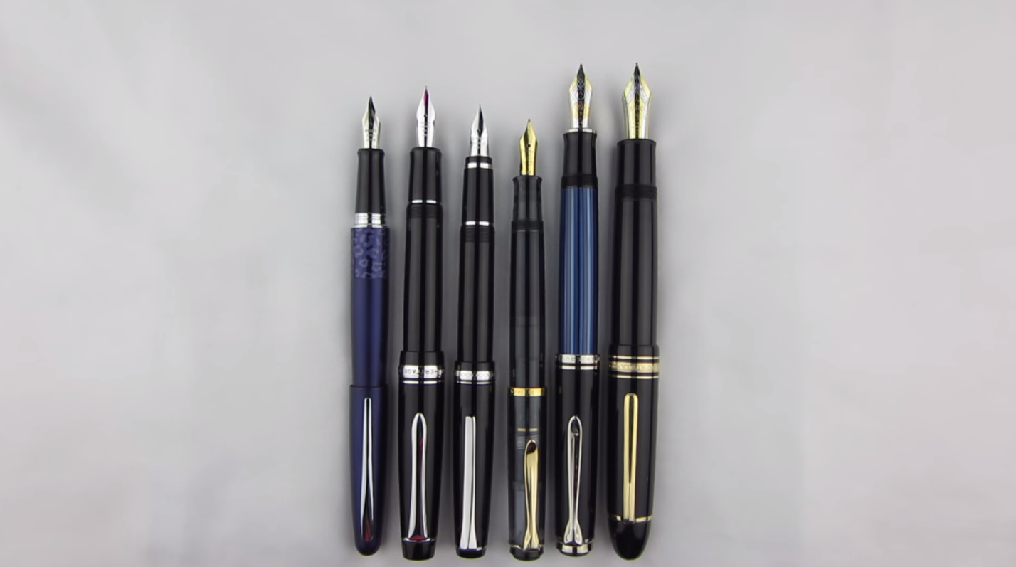
What I really like about this pen is the section. It’s relatively long and places the barrel threads as out of the way as possible to give you more room for your grip.
In the hand, the Falcon is very comfortable. Due to its resin construction the pen remains very light, only 19 grams when capped and a feather-like 10.4 when flying capless. It’s just a bit too small and light for me in this configuration and I much preferred writing with the cap posted. It attaches very securely and sits far enough down the barrel to prevent any weird weight distribution issues. If you like thin and light pens, this is the one for you.
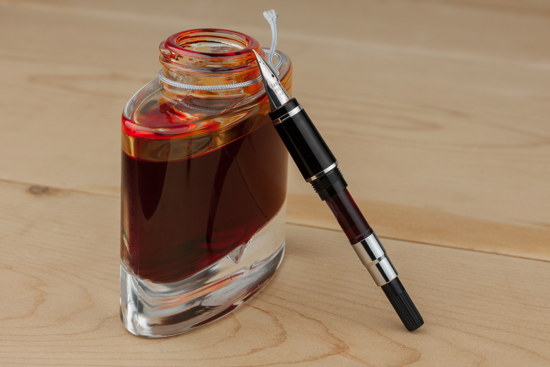 The Falcon does use Pilot’s proprietary cartridge/converter filling system but won’t accept the larger CON-70 pump converter. You’ll have to step up to the metal Falcon for that option. This pen does comes with the CON-50 twist converter with the agitator installed which helps prevent ink from clinging to the inside of the converter and interrupting flow to the nib. I’ve found the 0.1mL loss in capacity due to the agitator worth the trade-off for any possible flow issues. If max ink capacity is important to you, then you’ll want to refill a cartridge which will hold a solid 1.0mL of ink.
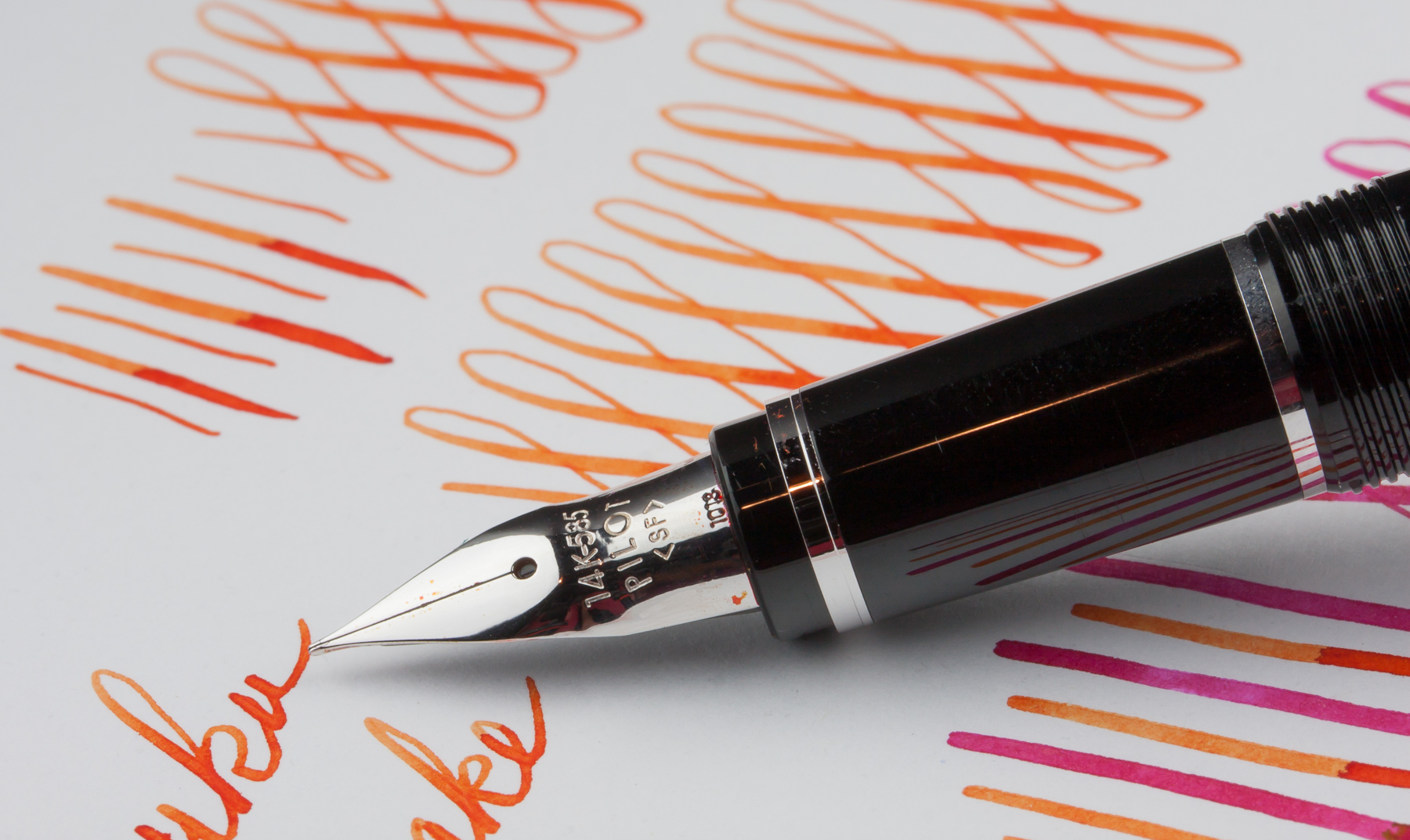 And putting ink on paper is this nib’s specialty. The “soft” descriptor in its nib width means you can spread the tines to get that beautiful line variation that lets everyone know you’re not using some pathetic ballpoint. I would classify this nib as semi-flexible since I was able to consistently achieve line widths up to 1.25mm. With no pressure at all, the fine nib will produce a line 0.4mm wide which is noticeably thinner than the fine nibs from European manufacturers which measure between 0.5-0.6mm.
The fine nib in this pen was smooth and quite pleasant to use both when flexing and not flexing the nib. I have used the extra fine nib in the metal Falcon and it was pretty sharp and scratchy.
In this side profile view (watch the video for this demonstration) you can really see how soft this nib is and just how far it moves away from the feed. I wasn’t pushing the nib any harder here than I normally would and am confident that I stayed well within the nibs capabilities.
This nib is soft, and it is flexible, but it’s also responsive. It’s not mushy, but on the other hand it also doesn’t require so much effort that your hand gets tired after a few words like what can happen with cheap, flexible steel nibs (a.k.a. Noodler’s). Most of the time, the feed is perfect but depending on the ink, you may experience some rail-roading. You’ll see a little bit of that happen here but the feed recovers quickly. Paper selection and how quickly you pull the nib across the page will also affect whether or not you experience any rail-roading.
By now, I’m sure you’re wondering how it compares to other modern flexible nibs. Well, the only one really worth comparing it to is the FA nib in the Pilot Custom Heritage 912. I guess the Justus 95 would be a good candidate, but I already did an entire video comparing that pen to the metal Falcon which is essentially the same pen as the resin Falcon. Anyway, there is a big difference between these two nibs. The FA nib is softer and I can easily get lines as wide as 1.8mm, compared to the Falcon’s 1.25mm. The Falcon is more consistent though and railroads less often. The Falcon is definitely the better buy as you’re getting more for your money, but if you must have the ultimate in modern flex, I think the FA is the way to go. Just be prepared to do some tweaking to make it shine.
The reduced flexibility of the Falcon means you gain more consistency in flow, resulting in less railroading. Now, I’m not doing an in-depth comparison between these two nibs but just know that what little rail-roading you see here from the Falcon is much less than what I’ve experienced with the FA nib.
When writing in my normal cursive script (as seen in the video) I’ve experienced very few instances where the nib will rail-road. Since I’m writing slower and not pushing the nib to the max on every stroke, it’s easier for the feed to keep up. I was very pleased with its consistent performance given the number of different inks I used.
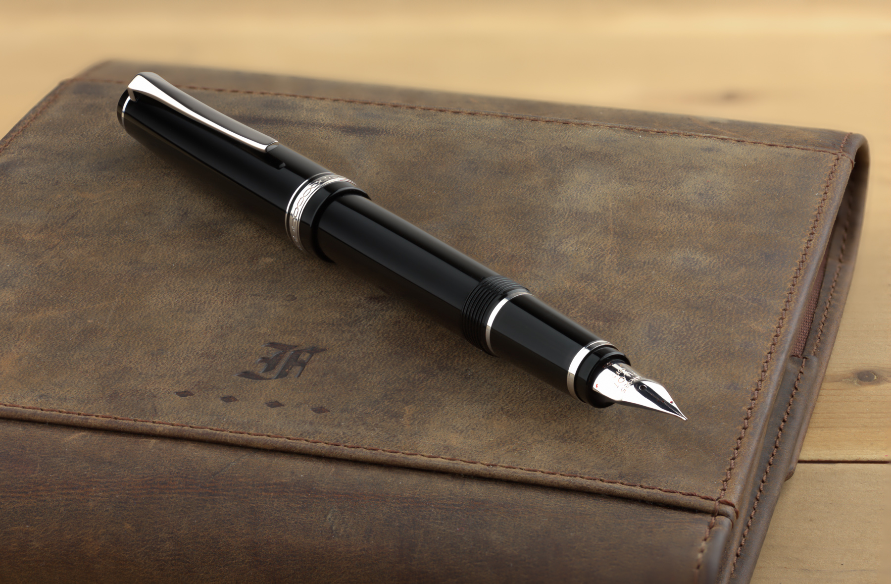 I had a great experience with the Falcon. It’s a well made, top tier pen with a fantastic nib that performed excellently out of the box. At $152, you’re getting a lot for your money. Initially, I kind of avoided this pen because of its nib shape. It’s design didn’t really appeal to me. But, now that I’ve used it, I’m a huge fan and the Falcon has now become one of three pens I recommend to people looking to spend around $150 for a pen. That’s how good it is.


Great video, I get in love with this pen please tell where I can buy one of this ones.
Does FA mean the same thing as Falcon? I’m getting a bit confused. You can get an FA nib in a 912 pen. The Falcon pen has a soft nib. In this statement in the review ” The Falcon is definitely the better buy as you’re getting more for your money, but if you must have the ultimate in modern flex, I think the FA is the way to go.” I thought the Falcon referred to the Falcon pen, and then the word “but” contrasts to the FA… I haven’t been able to find a clear answer, would you please help me clarify on if these are different nibs altogether, or just nibs that have been manufactured w/ poor quality control leading to variation. Thanks for your help!
No, FA does not mean the same thing as Falcon. There’s the FA Falcon nib, which I refer to as just FA, that can be had in the 743 and 912. Then there’s the Falcon which is the pen but can also refer to the nib in the Falcon pen.
See this video for more info: https://www.youtube.com/watch?v=iFiFm8sFIq0
[…] the hand, the Falcon is very comfortable,” said Dan at Nibsmith. “Due to its resin construction the pen remains very light, only 19 grams when capped […]
Hi.
Thx for review.
What are U think about metal Falcon SF nib?
What are the key difference between metal and resin version?
If the nib in metal F is softer?
The only difference between the metal and resin version is that material the cap and barrel are made from. The nibs in both pens are exactly the same.
OK. Which nib is more flexible: SF in Falcon or FA nib in Pilot 912?
Could you tell a bit more about your experience with Falcon SEF?
Would you recommend it for writing / drawing?
I am not quite sure which nib to choose.
How is the pen appearance now? Has the plating worn off?
I have a Pilot Facon with SF nib. The quality feel if the metal body is excellene, but I am disappointed with the nib. It very scratchy on upward strokes. I have had a UK nib expert improve it, but I would really like to just change the nib and feed to a Jowo or Bock, or any other decent nib Would this be possible ?
I have a falcon Pilot metal pen with a superfine nib which I would like to replace. Any suggestions.
Thaks much,
Bill